Appearance
BadgeAnnounce
A simple announcement badge component that displays a notification or feature announcement with a customizable label and clickable link.
Overview
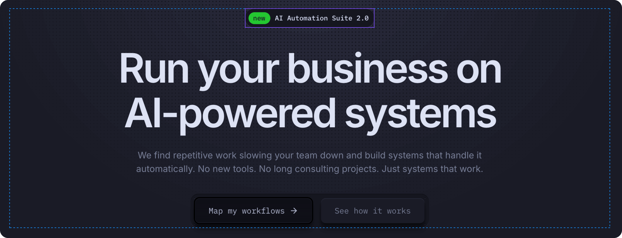
BadgeAnnounce is a lightweight component for drawing attention to important announcements, new features, or product updates. Perfect for the homepage hero section or above the main headline.
Key Features:
- Customizable badge label (e.g., "new", "beta", "hot")
- Main announcement text
- Interactive hover state — icon appears in the badge on hover
- Clickable link to detailed information
Interactive Behavior:
- Default state — Shows badge label and announcement text with icon on the right
- Hover state — Icon moves into the badge label (e.g., "new" becomes "new →"), creating an interactive visual feedback
How to Edit
To customize BadgeAnnounce:
- Select the component — Click BadgeAnnounce directly on the canvas, OR find it in the Layers panel and click its name
- Open Properties — The Properties panel (right sidebar) displays all editable fields
- Make changes — Edit any property and see changes update in real-time
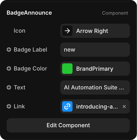
Property Controls
| Property | Type | Description |
|---|---|---|
| Icon | Icon Selector | Icon displayed in the badge (e.g., "Arrow Right", star, etc.) |
| Badge Label | String | Short label text in the colored badge (e.g., "new", "beta", "hot") |
| Badge Color | Color Token | Background color for the badge (default: BrandPrimary — green). Choose any color token from your design system |
| Text | String | Main announcement text (e.g., "AI Automation Suite 2.0") |
| Link | URL | Clickable link destination (e.g., "/blog/ai-automation-suite") |