Appearance
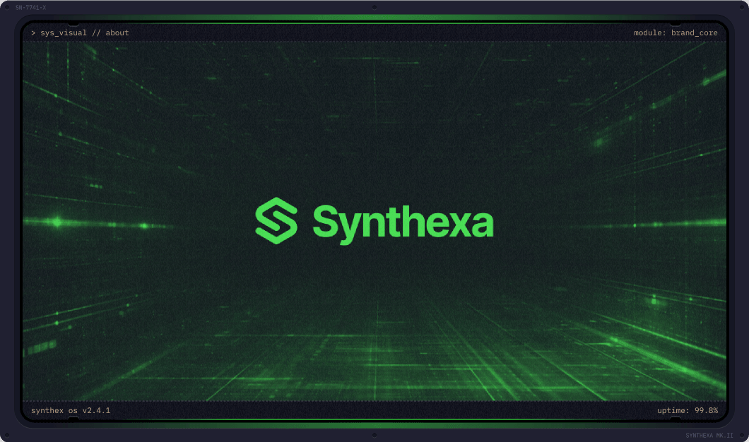
TerminalImage
A Framer design component that wraps any photo inside a retro CRT monitor frame with scanline effects, corner bolts, and editable text labels.
Property Controls
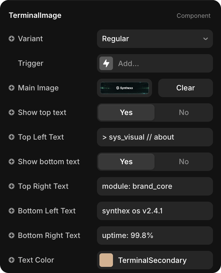
Variant
| Value | Description |
|---|---|
| Regular | Full-width featured image — used for hero sections and wide featured layouts |
| Small | Compact image — used for mobile breakpoints and smaller visuals like blog card photos |
Select the variant from the dropdown in the Properties panel.
Main Image
Click Main Image to upload or replace the photo displayed inside the monitor screen.
Any image you place is automatically tinted with the /Terminal/TerminalPrimary color token.
Show top text / Show bottom text
| Property | Default | Description |
|---|---|---|
| Show top text | Yes | Toggle visibility of the top label row (Top Left + Top Right) |
| Show bottom text | Yes | Toggle visibility of the bottom label row (Bottom Left + Bottom Right) |
Text Labels
Four independent text strings positioned in the corners of the monitor frame:
| Property | Position |
|---|---|
| Top Left Text | Top-left corner |
| Top Right Text | Top-right corner |
| Bottom Left Text | Bottom-left corner |
| Bottom Right Text | Bottom-right corner |
Edit each field directly in the Properties panel — no need to enter component edit mode.
Text Color
| Property | Default | Description |
|---|---|---|
| Text Color | TerminalSecondary | Color applied to all four label strings |
Defaults to the /Terminal/TerminalSecondary token. Change to any color or token as needed.