Appearance
CardServices
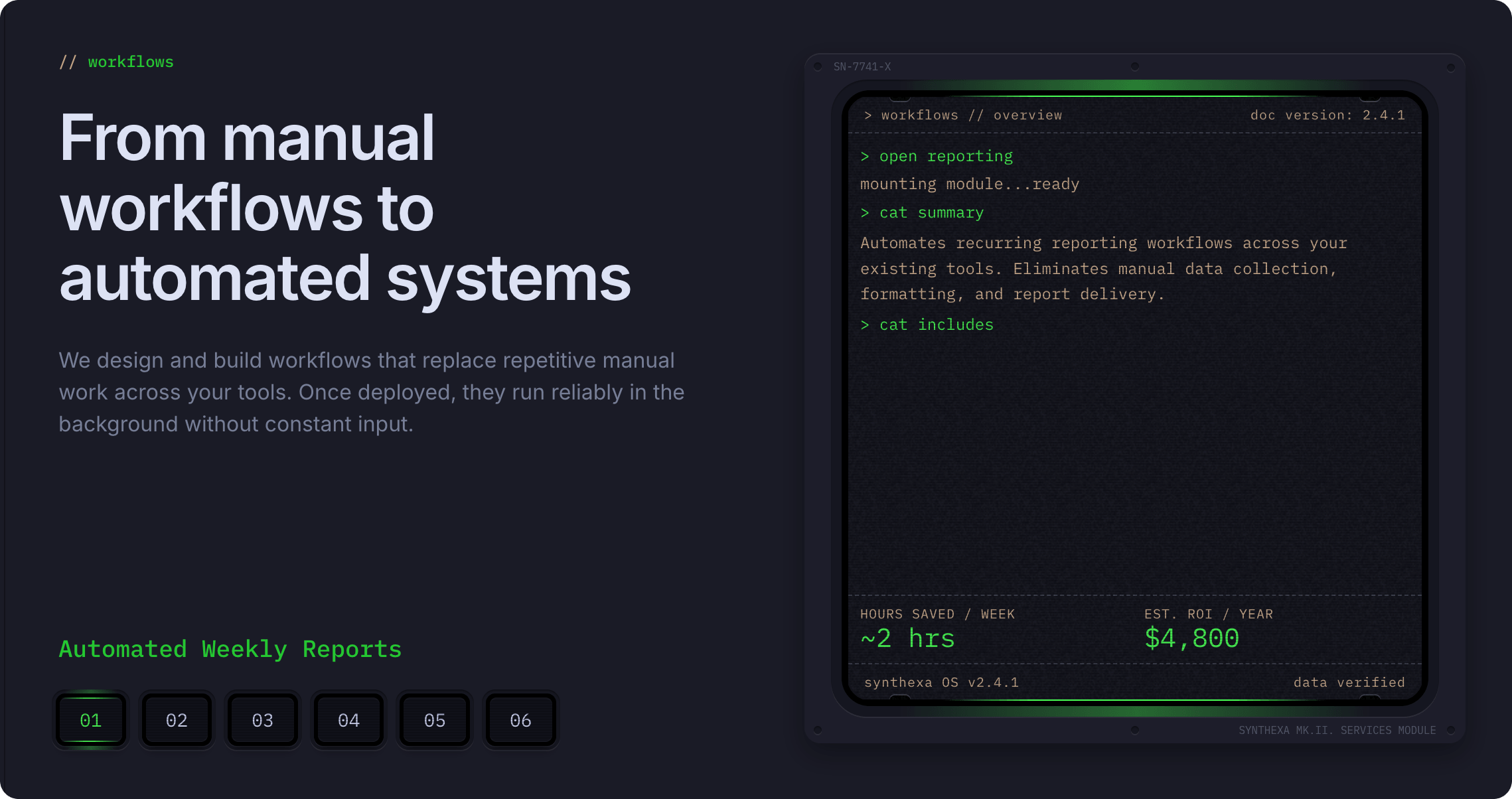
A flexible section component that showcases six company services with terminal-themed dashboards. Each service has a dedicated variant with customizable content and metrics display.
Overview
CardServices displays a collection of automation services with an interactive variant switcher. Each of the six services is represented by a variant that contains an embedded TerminalDashboard for detailed metrics and information.
How to Edit
Select the Component
To customize CardServices properties:
- Select the component — Click CardServices directly on the canvas, OR find it in the Layers panel and click its name
- Open Properties — The Properties panel (right sidebar) displays all section-level properties
- Make changes — Edit properties and see changes update in real-time
Property Controls
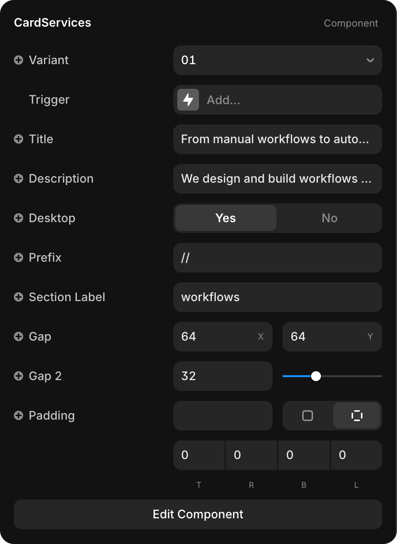
Content
| Property | Type | Default | Description |
|---|---|---|---|
| Variant | Dropdown | 01 | Select which service variant to display (01–06) |
| Title | String | "From manual workflows to auto..." | Section heading displayed above the service content |
| Description | String | "We design and build workflows..." | Detailed explanation of the services |
| Desktop | Toggle | Yes / No | Controls whether the service displays on desktop or mobile layout |
| Prefix | String | "//" | Visual prefix before the section label (e.g., "//") |
| Section Label | String | "workflows" | Label text displayed in the section header |
Edit Individual Service Variants
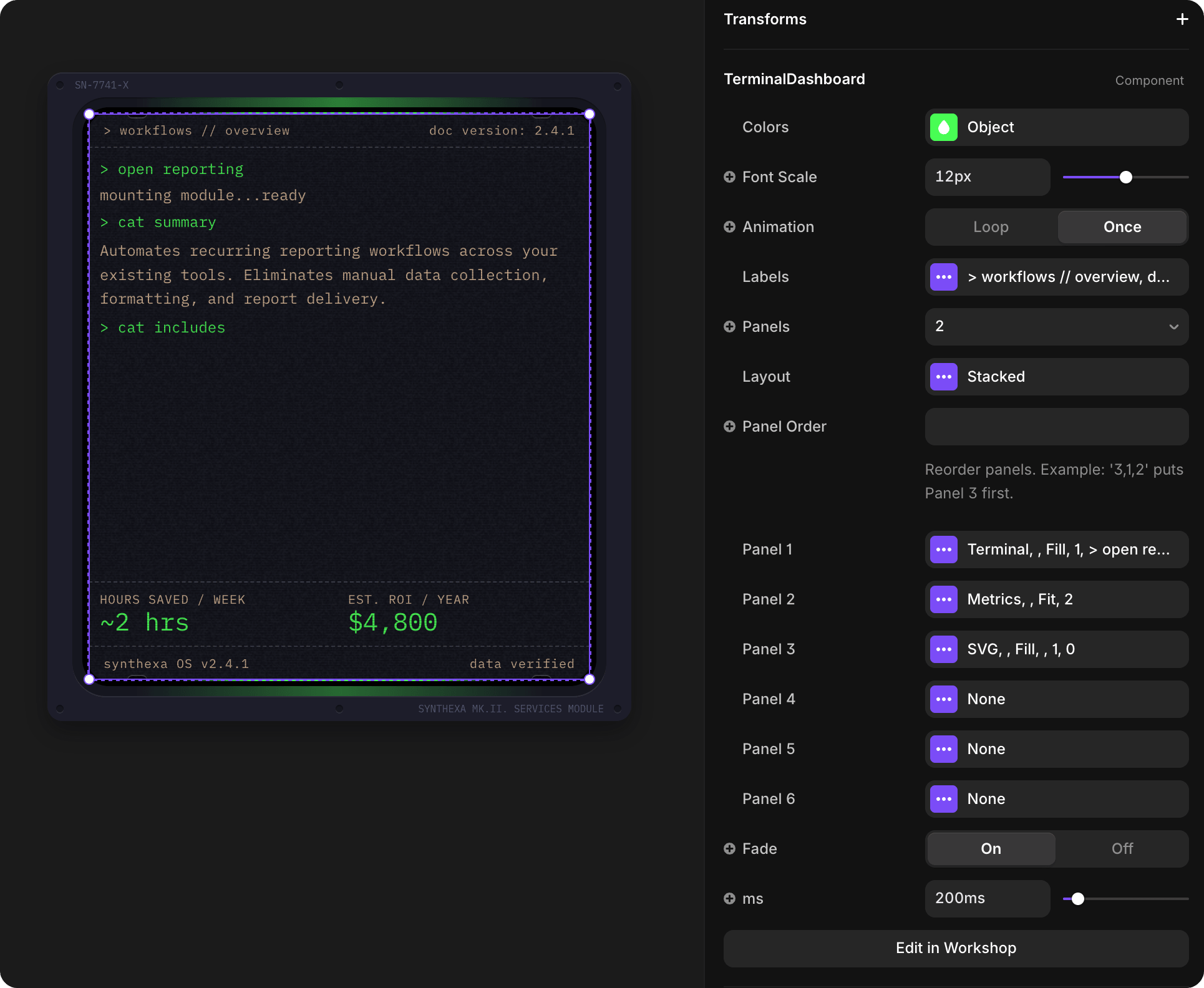
Each variant displays the same structure with a TerminalDashboard that shows service-specific metrics and details. To customize the TerminalDashboard inside each service variant:
- Click Edit Component button at the bottom of Properties
- You'll see all 6 service variants (buttons 01–06)
- Click on the TerminalDashboard inside the selected variant
- Edit its properties (metrics, colors, panel layout, etc.)
- Refer to TerminalDashboard documentation for all available properties