Appearance
TerminalDashboard
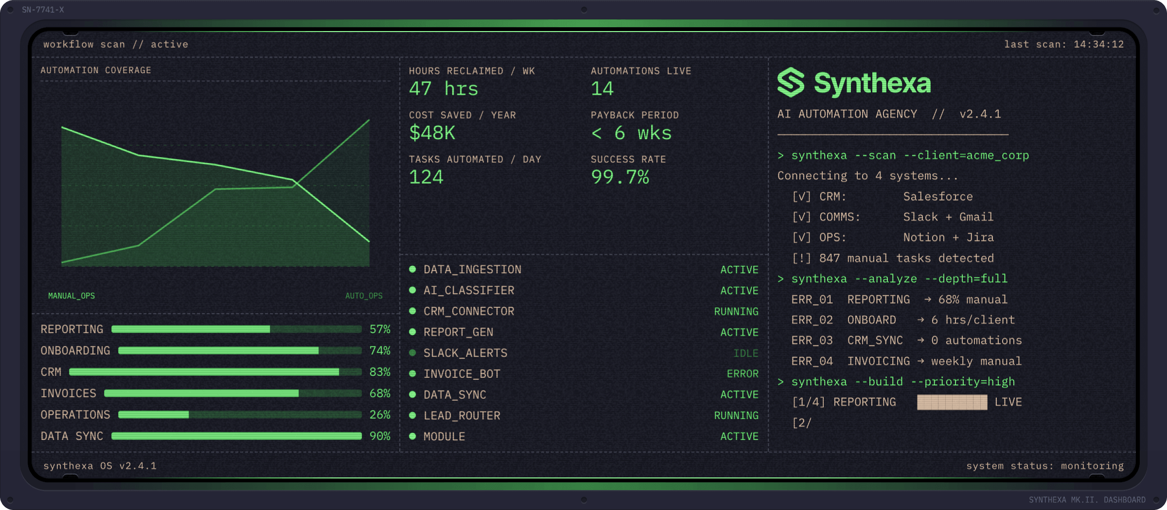
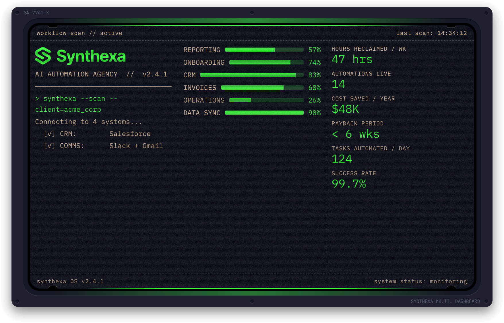
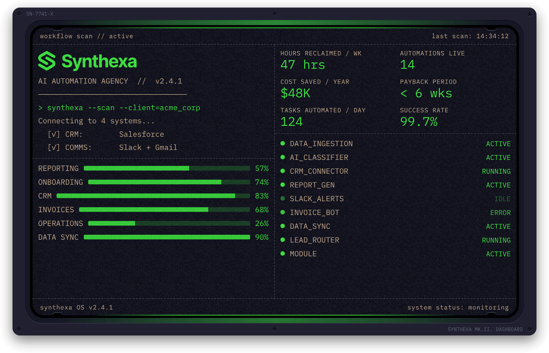
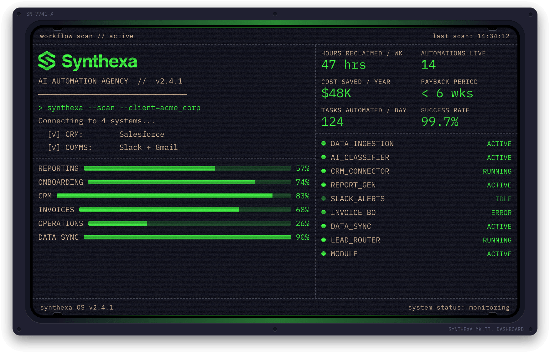
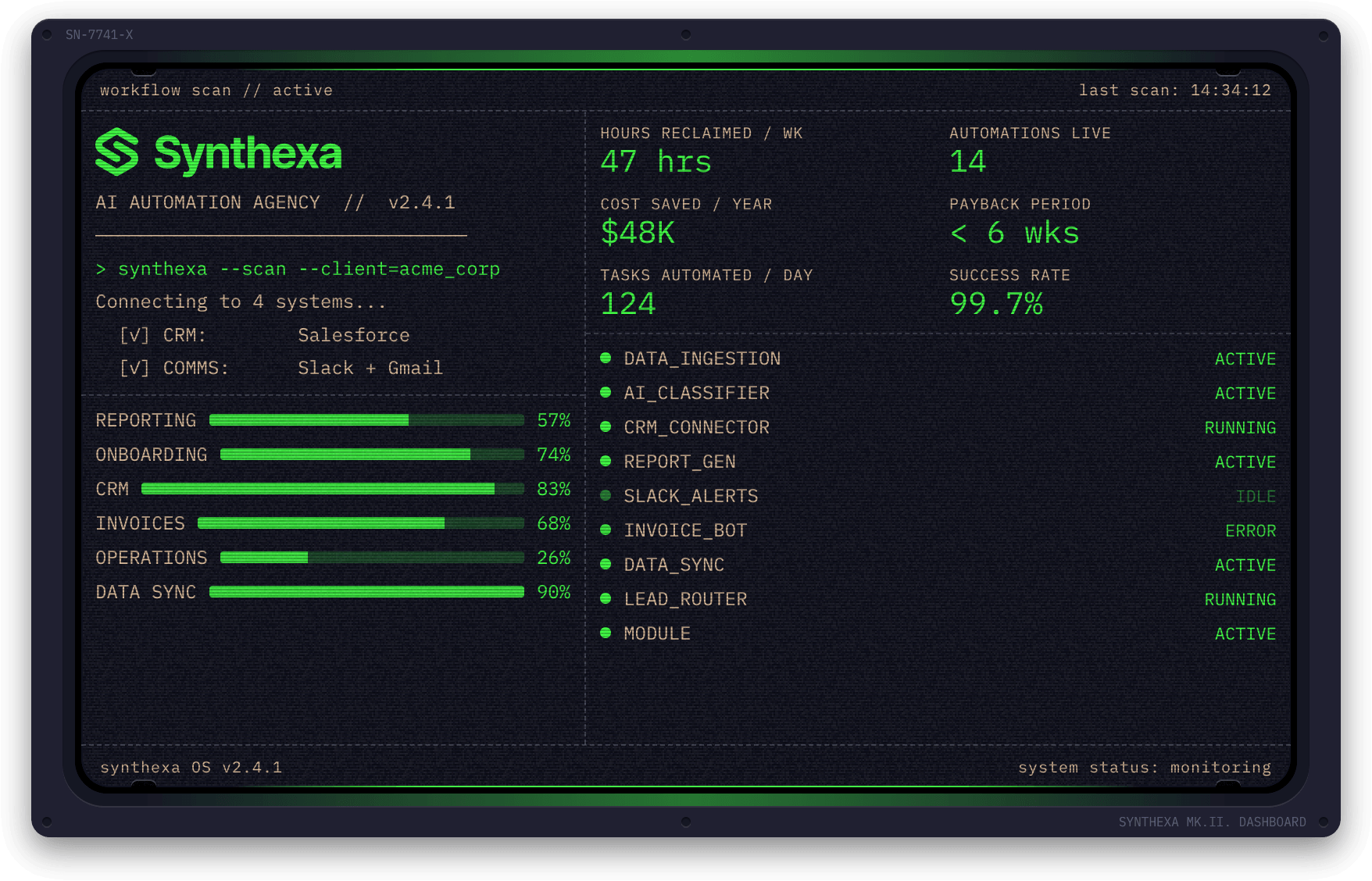
The signature component of SYNTHEXA — a fully animated multi-panel data visualization widget with a CRT terminal aesthetic.
Used in the homepage hero and across the site to showcase metrics, status, and automation workflows.
Overview
The TerminalDashboard is a code component that renders:
- Multi-panel layouts with configurable panels (1–6)
- Animated typewriter text (Terminal panel)
- Data visualizations (Sparkline, Bars, Ring, Status)
- Metrics tiles with labels
- SVG rendering for custom graphics
- Customizable colors and animations
- Full responsive design
Property Controls
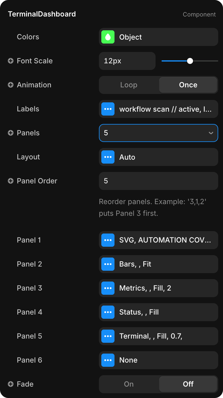
Appearance
| Property | Type | Default | Description |
|---|---|---|---|
| Colors | Object | Project tokens | Color overrides for Primary, Secondary, Lines, Background |
| Font Scale | Slider | 12px | Base font size for all dashboard text |
| Animation | Enum | Loop | Loop (continuous) or Once (play once on mount) |
| Fade | Toggle | On | Fade-in animation on component mount |
Content
| Property | Type | Default | Description |
|---|---|---|---|
| Labels | Object | See below | Header/footer label strings |
| Panels | Number | 6 | Number of active panels (1–6) |
| Panel Order | String | Empty | Reorder panels (e.g., "3,1,2") |
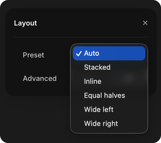
Layout
| Property | Type | Default | Description |
|---|---|---|---|
| Layout | Enum | Auto | Preset layout: Auto, Stacked, Inline, Equal halves, Wide left, Wide right |
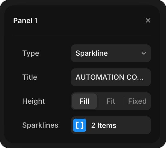
Individual Panels
Each Panel (1–6) has common properties:
| Property | Type | Description |
|---|---|---|
| Type | Enum | Terminal, Bars, Ring, Sparkline, Status, SVG, None |
| Title | String | Optional panel header |
| Height | Enum | Fill (stretch to available space), Fit (to content), or Fixed |
Panel-specific properties appear below based on the Type selected.
Panel Types
Terminal
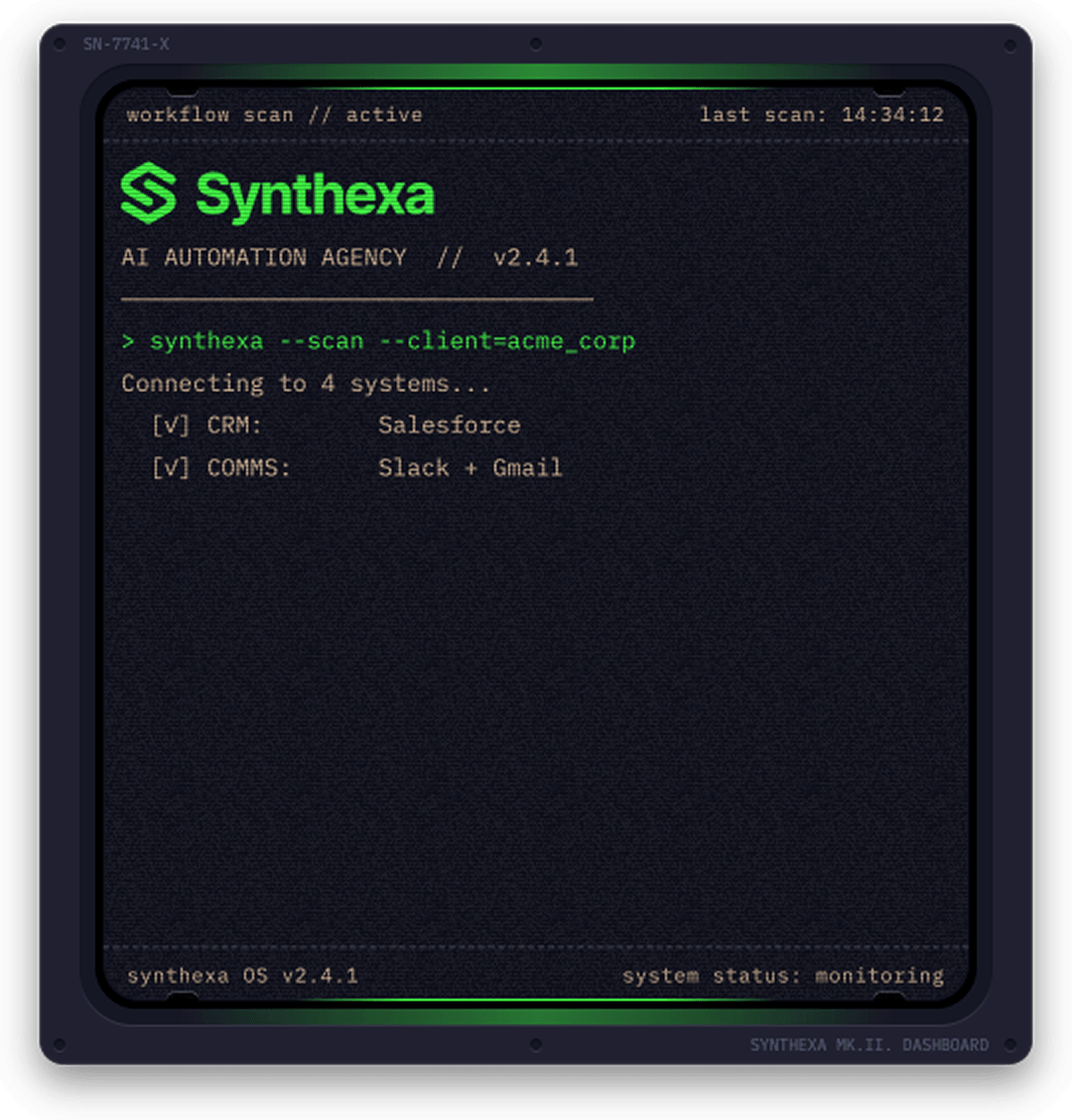
Animated typewriter with input/output lines.
| Property | Type | Description |
|---|---|---|
| Speed | Slider | Animation speed (1 = normal, higher = faster) |
| Script | Text | Multiline terminal script (overrides Lines if provided) |
| Lines | Array | Individual line items (used only if Script is empty) |
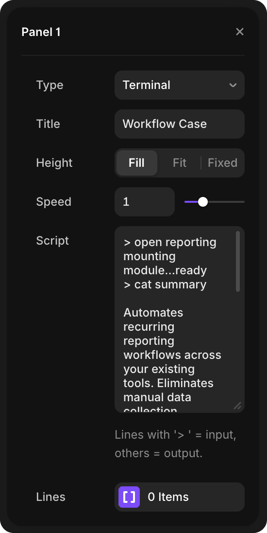
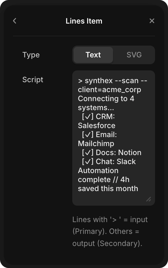
Script format:
- Lines starting with
>(greater-than symbol) render as input (Primary color) - All other lines render as output (Secondary color)
- When Script is filled, it overrides the Lines array configuration
Lines array:
- Use when Script is empty to have granular control over individual lines
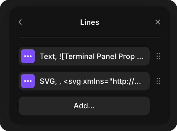
Each line item can be either:
- Text — Terminal text line (same
>prefix rules apply)
- SVG — Inline SVG graphic (useful for rendering graphics mid-animation)
- Text — Terminal text line (same
Note: Use either Script (for simple text input) OR Lines array (for granular/mixed text+SVG control), not both.
Example:
> synthexa --scan --client=acme_corp
Connecting to 4 systems...
  [✓] CRM: Salesforce
  [✓] Email: Mailchimp
  [✓] Docs: Notion
  [✓] Chat: Slack
Automation complete // 4h saved this month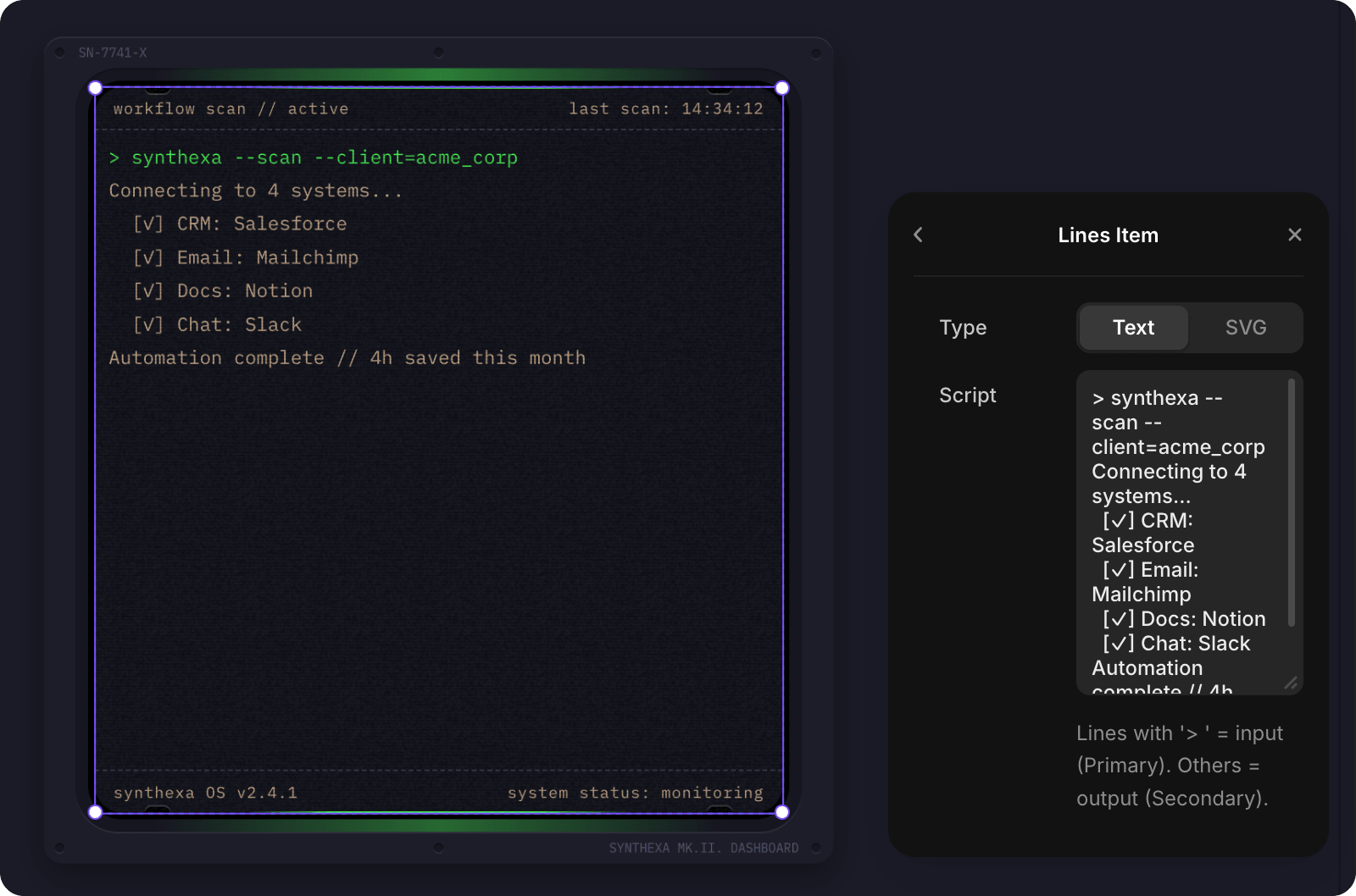
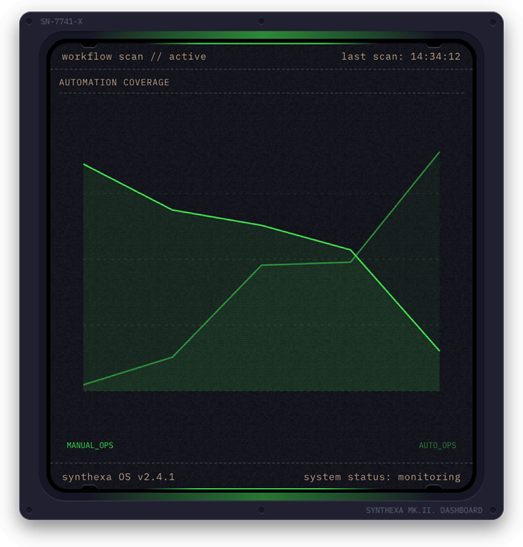
Sparkline
Canvas chart for showing trends.
| Property | Type | Description |
|---|---|---|
| Sparklines | Array | Collection of sparkline data series |
Each sparkline item contains:
- Label — Legend label for the line
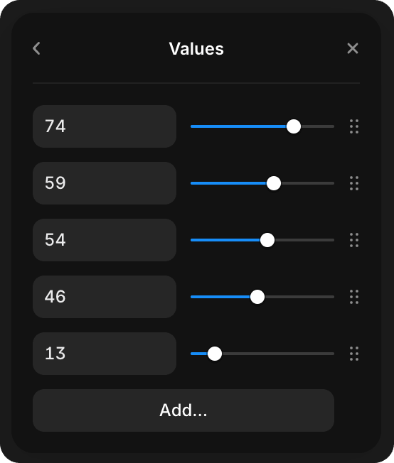
- Values — Array of numbers (0–100) representing the trend (add/remove values with sliders)
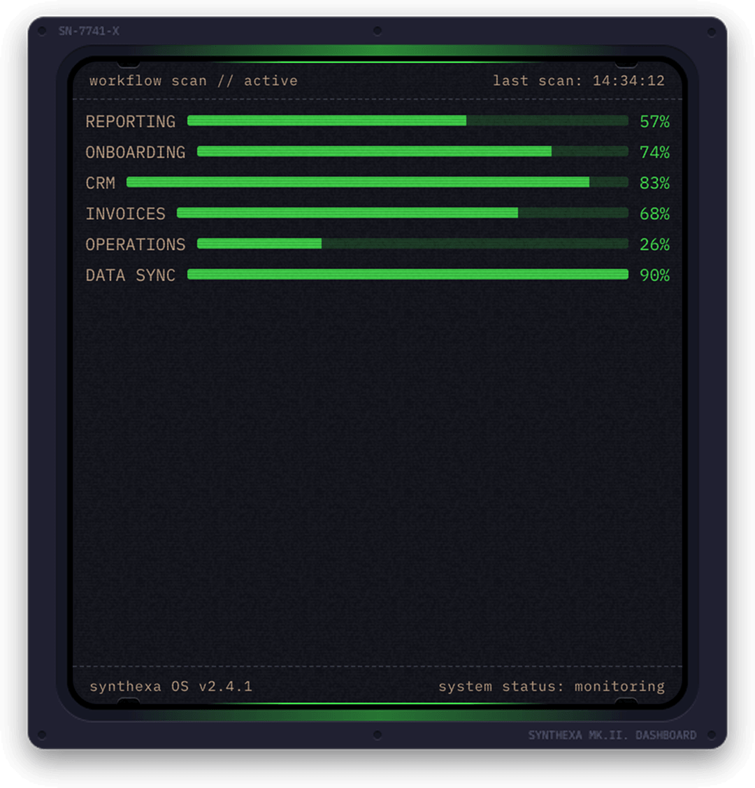
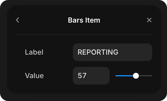
Bars
Animated horizontal bar chart for comparing percentages.
| Property | Type | Description |
|---|---|---|
| Bars | Array | Collection of bar items |
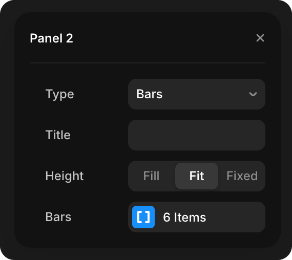
Each bar item contains:
- Label — Bar label
- Value — Numeric value (0–100 for percentage display)
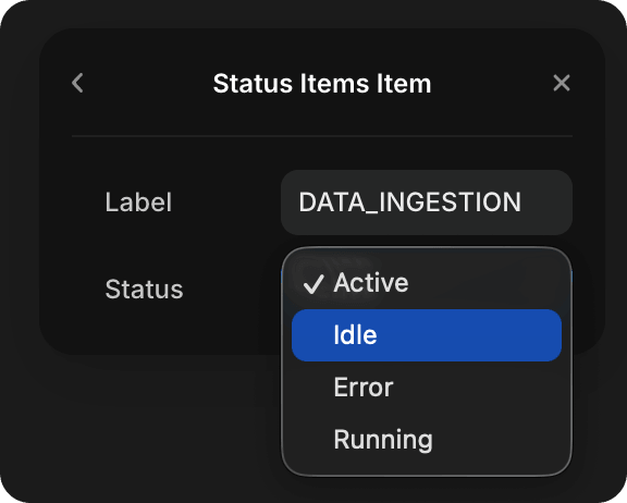
Status
Live status list with pulsing indicators.
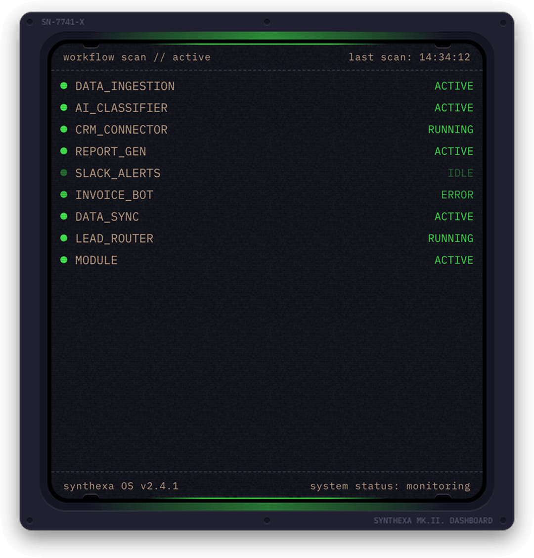
| Property | Type | Description |
|---|---|---|
| Status Items | Array | Collection of status indicators |
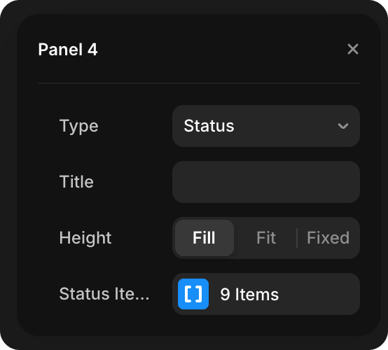
Each status item contains:
- Label — Status label
- State — Status state (Active, Idle, Running, Error)
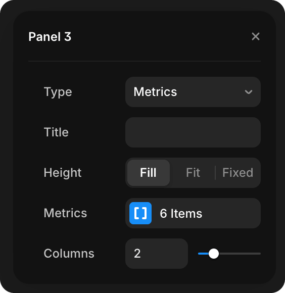
Metrics
Key metric tiles with label + value.
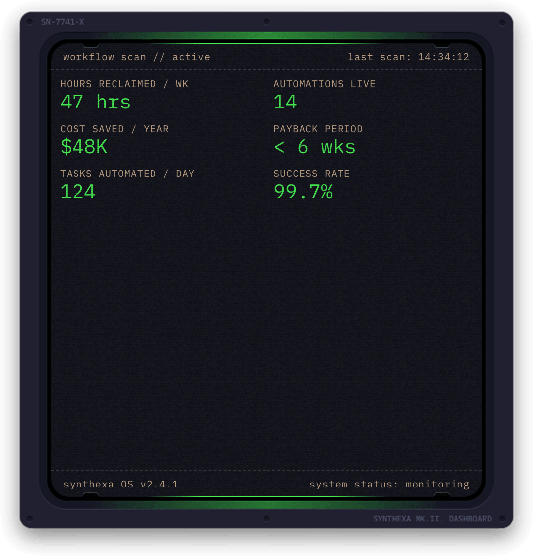
| Property | Type | Description |
|---|---|---|
| Metrics | Array | Collection of metric items |
| Columns | Slider | Number of columns (1–6) for layout |
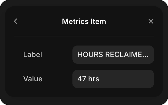
Each metric item contains:
- Label — Metric label (e.g., "Processes running")
- Value — Metric value (e.g., "247" or "99.97%")
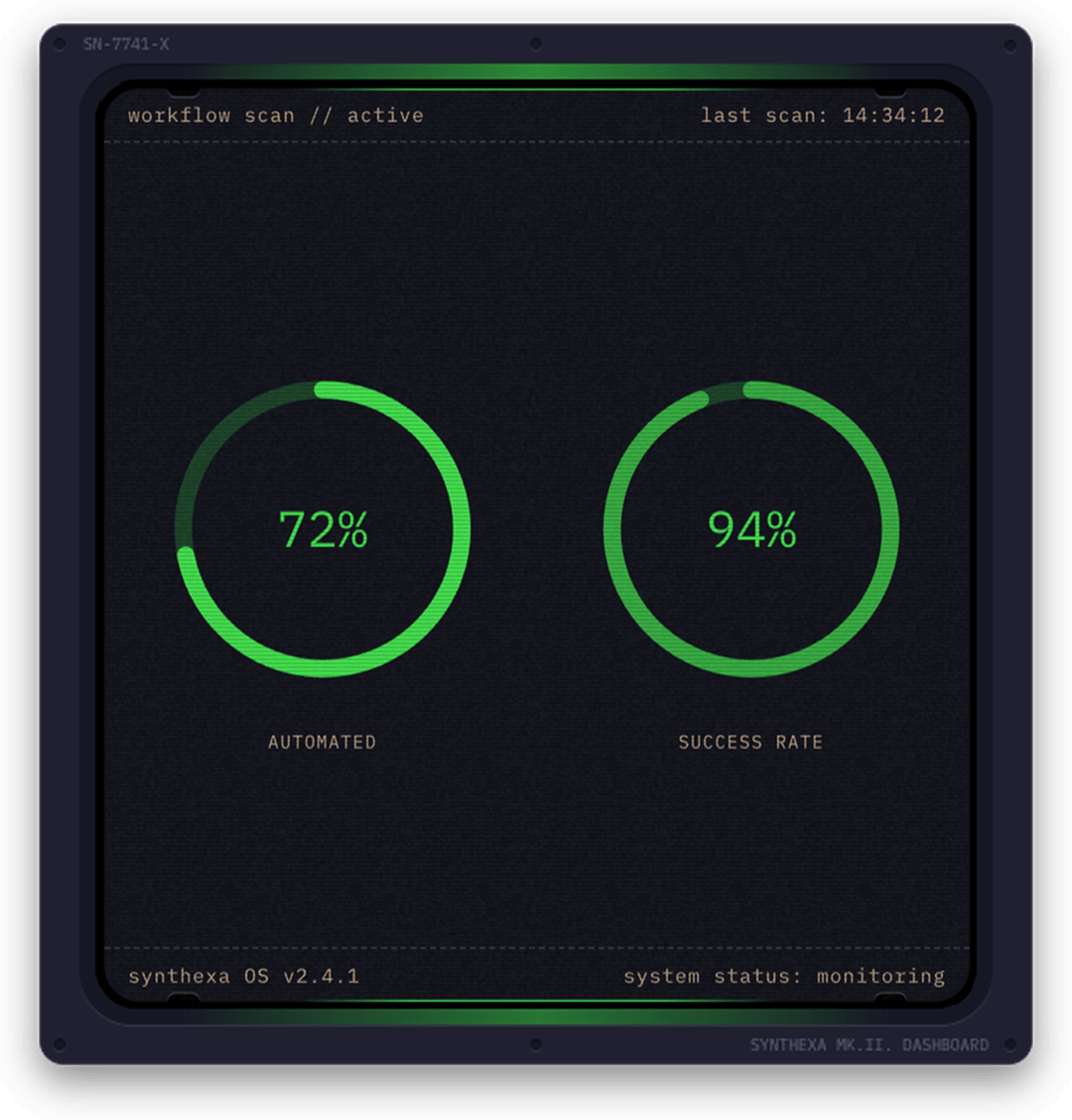
Ring
Animated circular gauge. Single and Dual mode.
| Property | Type | Description |
|---|---|---|
| Ring Mode | Enum | Single (one ring) or Dual (two concentric rings) |
| Ring 1 % | Slider | First ring percentage (0–100) |
| Ring 1 Label | Text | Label for first ring |
| Ring 2 % | Slider | Second ring percentage (0–100, Dual mode only) |
| Ring 2 Label | Text | Label for second ring (Dual mode only) |
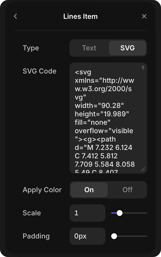
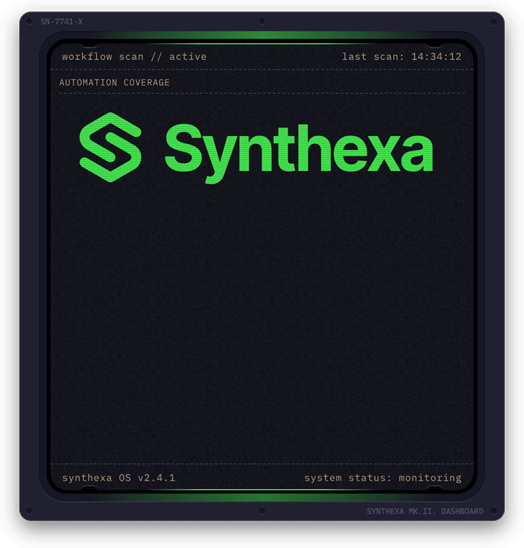
SVG
Render custom SVG graphics with optional color theming.
| Property | Type | Description |
|---|---|---|
| SVG Code | Text | Raw SVG markup |
| Apply Color | Toggle | Apply Primary color accent to SVG |
| Scale | Slider | SVG scale factor (0.1–5) |
| Padding | Slider | Padding around SVG (0–32px) |
Tips:
- Paste complete
<svg>tags into SVG Code - Enable "Apply Color" to tint the SVG with the TerminalPrimary token color
- Use Scale to resize the SVG within the panel
- Padding adds space around the SVG content
None
Empty panel — use to disable a slot or add intentional whitespace.
Layout Presets
Auto
Automatically arranges panels based on count and aspect ratios.
Stacked
Panels stack vertically.
┌────────┐
│ Panel1 │
├────────┤
│ Panel2 │
├────────┤
│ Panel3 │
└────────┘
Inline
Panels arrange horizontally.
┌────┬────┬────┐
│ P1 │ P2 │ P3 │
└────┴────┴────┘
Equal Halves
Two columns of equal width.
┌────┬────┐
│ P1 │ P2 │
├────┼────┤
│ P3 │ P4 │
└────┴────┘
Wide Left / Wide Right
Asymmetric two-column layout where one column is wider than the other.
Wide Left: Left column is wider
┌──────────┬────┐
│  Panel   │ P2 │
│    1     ├────┤
│          │ P3 │
└──────────┴────┘
Wide Right: Right column is wider
┌────┬──────────┐
│ P2 │  Panel   │
├────┤    1     │
│ P3 │          │
└────┴──────────┘
Panels fill the available space in their column regardless of count.
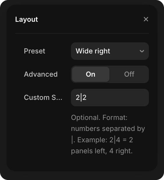
Custom Layout
Create a custom layout using a split string:
- In the Layout properties, toggle Advanced to On
- Enter a Custom Split string (e.g.,
2|2for 2 panels left, 2 right)
Format: Numbers separated by | representing panel counts in each column.
WARNING
The sum of the split numbers must equal the total Panels count set above. For example, if you have 6 panels, use 2|2|2 (2+2+2=6), not 2|3.
Examples (with 6 total panels):
2|2|2— 2 panels in each of 3 columns (2+2+2=6)2|4— 2 panels on left, 4 on right (2+4=6)3|2|1— 3 panels left, 2 middle, 1 right (3+2+1=6)
Colors
| Field | Default Token | Controls |
|---|---|---|
| Primary | /Terminal/TerminalPrimary | Canvas elements, input lines, active indicators |
| Secondary | /Terminal/TerminalSecondary | Output lines, labels |
| Lines | /Terminal/TerminalLines | Panel borders |
| Background | /Background/BackgroundBase | Component background |
Animation Settings
Loop
Typewriter animation repeats continuously (loops).
Once
Typewriter animation plays once on component mount, then freezes and doesn't repeat.
Fade
Fade-in animation when component mounts:
- On — Component fades in with customizable duration (default 200ms, range 50–2000ms)
- Off — Component appears instantly
Common Configurations
Simple Status Dashboard
Panels: 3
Layout: Stacked
- Panel 1: Status (Active services)
- Panel 2: Ring (99% uptime)
- Panel 3: Metrics (Key stats)
Process Visualization
Panels: 2
Layout: Wide left
- Panel 1: Terminal (Workflow script)
- Panel 2: Sparkline (Performance over time)
Metric Overview
Panels: 4
Layout: Equal halves
- Panel 1: Metrics (Team size)
- Panel 2: Ring (Capacity)
- Panel 3: Bars (Workload distribution)
- Panel 4: Status (System status)