Appearance
ROICalculator
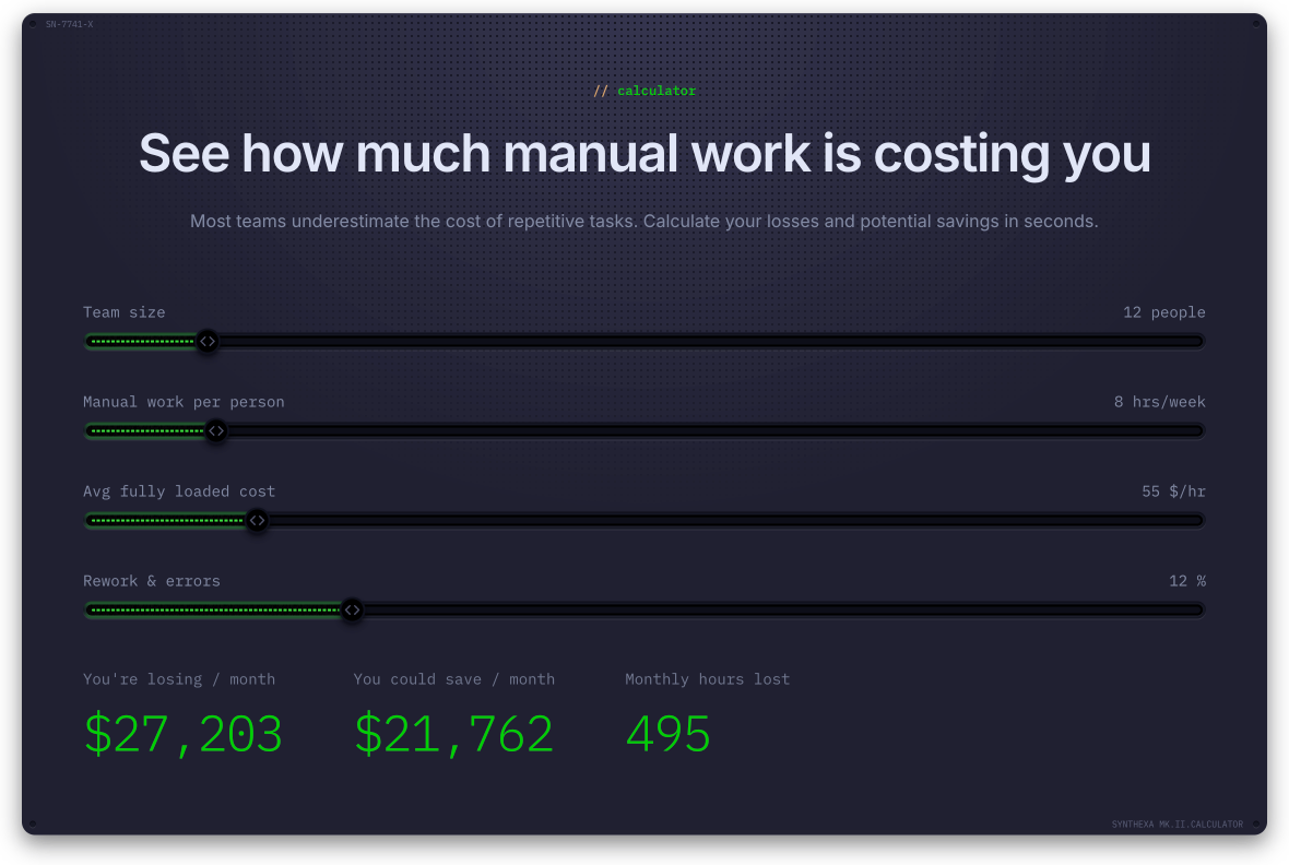
An interactive code component that estimates automation savings. Users adjust sliders in real-time to see cost-benefit calculations.
Overview
The ROICalculator demonstrates the value of automation by letting visitors input their team details and see potential savings.
Key Features:
- Interactive sliders for input parameters
- Real-time calculation of savings
- Customizable inputs and formulas
- Fully branded styling
- Mobile responsive
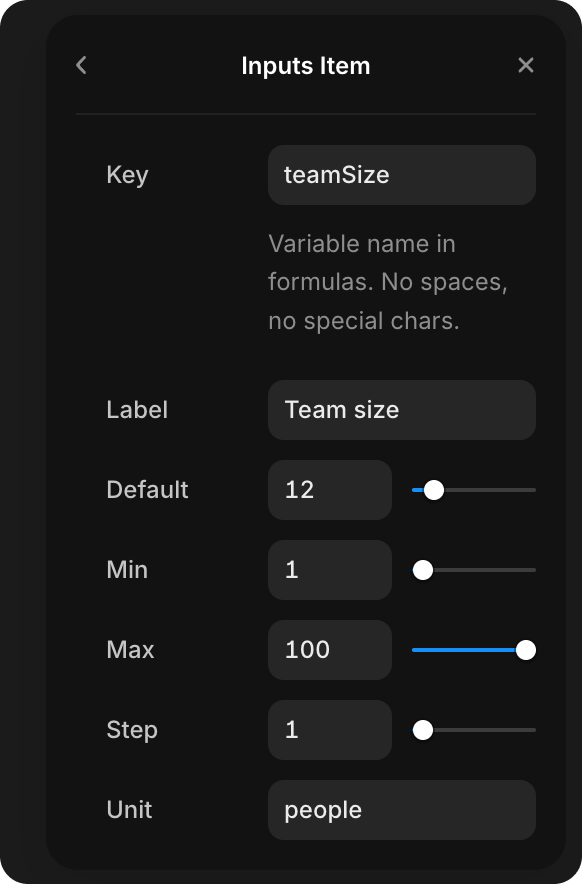
Default Inputs
| Key | Label | Default | Range | Step | Unit |
|---|---|---|---|---|---|
teamSize | Team size | 12 | 1–100 | 1 | people |
hoursPerWeek | Manual work per person | 8 | 1–60 | 1 | hrs |
hourlyRate | Avg fully loaded cost | 55 | 10–300 | 5 | $/hr |
errorRate | Rework & errors | 12 | 0–50 | 1 | % |
Default Variables
Fixed constants used in all formulas — not exposed to the user as sliders.
| Key | Value | Meaning |
|---|---|---|
weeksPerMonth | 4 | Weeks per month multiplier |
inefficiencyFactor | 1.15 | Overhead multiplier for workflow inefficiencies |
savingsRate | 0.8 | Share of losses that automation can recover (80%) |
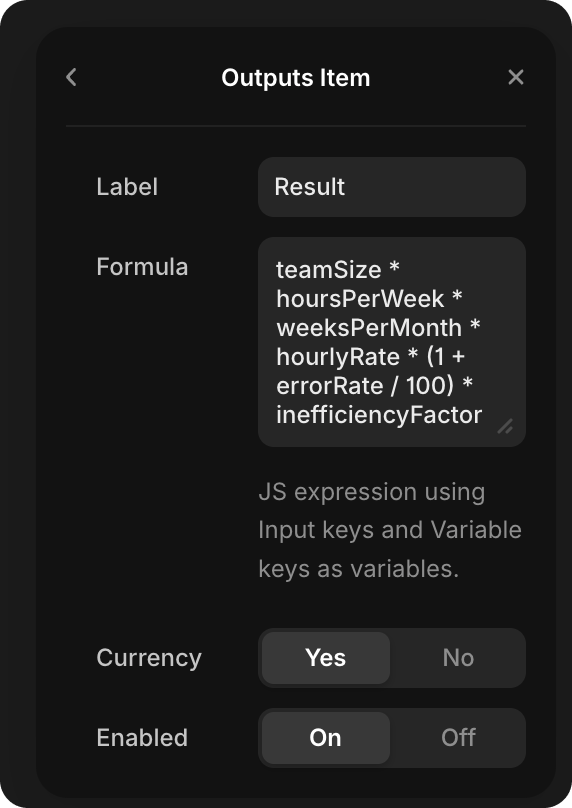
Default Outputs
| Label | Formula | Format |
|---|---|---|
| You're losing / month | teamSize * hoursPerWeek * weeksPerMonth * hourlyRate * (1 + errorRate / 100) * inefficiencyFactor | Currency |
| You could save / month | ... * savingsRate (same as above × 0.8) | Currency |
| Monthly hours lost | teamSize * hoursPerWeek * weeksPerMonth * (1 + errorRate / 100) * inefficiencyFactor | Number |
With default values (12 people, 8 hrs, $55/hr, 12% errors):
- Losing / month ≈ $27,203
- Could save / month ≈ $21,762
- Hours lost / month ≈ 495 hrs
Customization
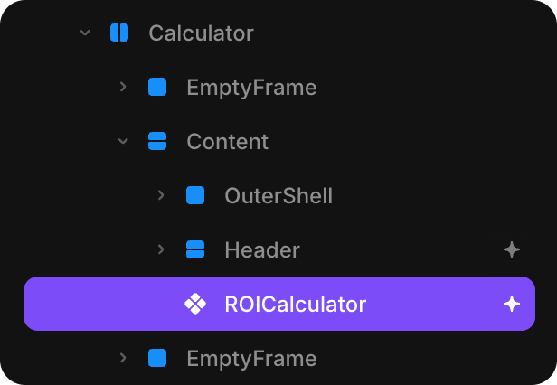
Step 1: Select the Component
Click the ROICalculator component on your page or in the layer panel.
Step 2: Open Properties Panel
Open the Properties panel (right sidebar) to see customization options.
Step 3: Configure Variables
Variables are fixed constants used in formulas — they don't change via sliders and are not visible to the user. Use them for rates, coefficients, or any value you want to control centrally without exposing to users.
Option A: Use Defaults
- Leave Variables set to "Default"
- No additional constants are available
Option B: Custom Variables
- Set Variables to "Custom"
- Add items with a Key (variable name) and Value (numeric constant)
- Each variable is available in all output formulas by its key name
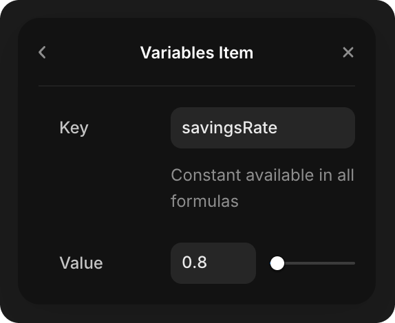
Example:
- Key:
savingsRate, Value:0.8— then useteamSize * hoursPerWeek * savingsRatein formulas
Step 4: Configure Inputs
Option A: Use Defaults
- Leave Inputs set to "Default"
- Calculator uses the values above
Option B: Custom Inputs
- Set Inputs to "Custom"
- Define your own input fields and ranges
- Examples: "Projects handled", "Cost per project", "Automation budget"
Step 5: Configure Outputs
Option A: Use Defaults
- Leave Outputs set to "Default"
- Shows the three predefined outputs
Option B: Custom Outputs
- Set Outputs to "Custom"
- Define what calculations to display
- Formula fields accept JavaScript expressions
Step 6: Formulas
When using Custom outputs, you can write formulas:
Example Formula:
javascript
teamSize * hoursPerWeek * hourlyRate * 4This calculates: 12 * 8 * 55 * 4 = $21,120/month
Available in formulas:
- Input names from your custom inputs
- Variable keys from your custom variables
- Standard JavaScript functions (Math.round, etc.)
- Comparison operators (>, <, ==)
Step 7: Styling
See the full Property Controls section below for all visual options.
Property Controls
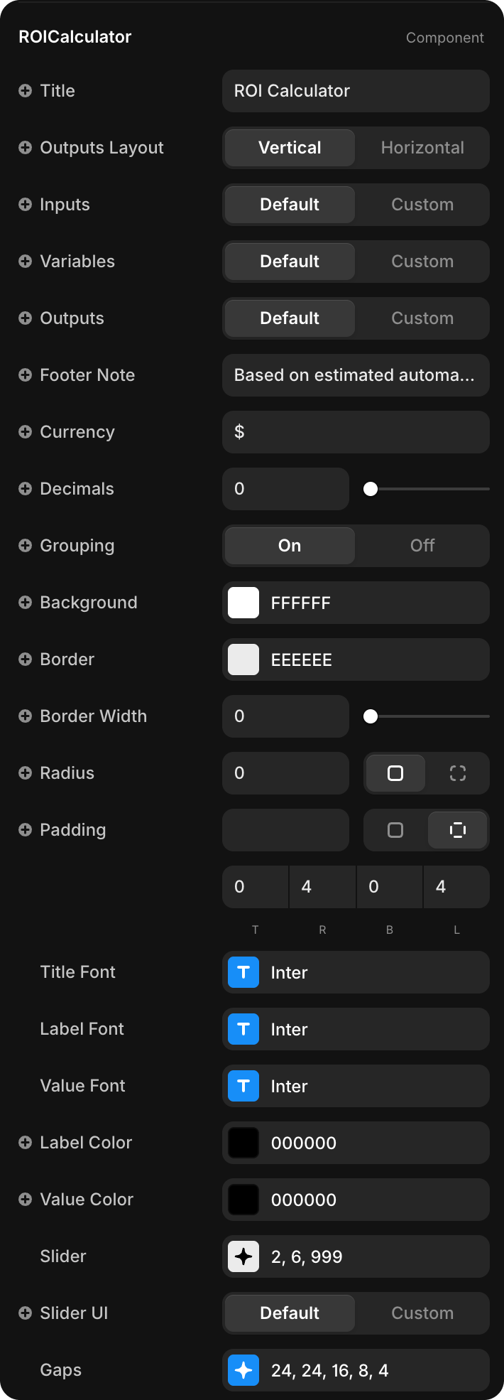
Content
| Property | Type | Default | Description |
|---|---|---|---|
| Title | String | "ROI Calculator" | Heading displayed above the sliders. Leave empty to hide |
| Outputs Layout | Enum | Vertical | Vertical — outputs stack top to bottom; Horizontal — outputs line up side by side |
| Footer Note | String | "Based on estimated..." | Small note below outputs. Leave empty to hide |
Currency
| Property | Type | Default | Description |
|---|---|---|---|
| Currency | String | $ | Symbol prepended to currency-formatted outputs |
| Decimals | Number | 0 | Decimal places for currency values (0–6) |
| Grouping | Toggle | On | On — thousands separator (e.g. $27,203); Off — no separator |
Appearance
| Property | Type | Default | Description |
|---|---|---|---|
| Background | Color | #FFFFFF | Component background color |
| Border | Color | #EEEEEE | Border color |
| Border Width | Number | 0 | Border thickness in px (0–12) |
| Radius | BorderRadius | 0px | Corner rounding |
| Padding | Padding | 0 4 0 4 | Inner padding (top, right, bottom, left) |
Typography
Three independent font controls — each sets the typeface, weight, size, letter-spacing, and line-height:
| Property | Applies To | Default |
|---|---|---|
| Title Font | Component heading | Inter, Semibold, 18px, -0.02em, 1.2em |
| Label Font | Slider labels, output labels, footer note | Inter, Medium, 12px, -0.01em, 1.2em |
| Value Font | Output result values | Inter, Semibold, 24px, -0.03em, 1.1em |
| Property | Type | Default | Description |
|---|---|---|---|
| Label Color | Color | #000000 | Color for all labels and footer note |
| Value Color | Color | #000000 | Color for output values and the title |
Slider
The Slider property group controls the appearance of the native slider bar:
| Sub-property | Type | Default | Description |
|---|---|---|---|
| Track | Color | #EEEEEE | Unfilled portion of the slider track |
| Fill | Color | #000000 | Filled portion (left of thumb) |
| Thumb | Color | #FFFFFF | Draggable thumb handle color |
| Thumb Border | Number | 2 | Border width around the thumb in px (0–10) |
| Height | Number | 6 | Track height in px (2–16) |
| Radius | Number | 999 | Track corner radius (999 = fully rounded pill) |
Slider UI
| Property | Type | Default | Description |
|---|---|---|---|
| Slider UI | Enum | Default | Default — uses the native styled slider; Custom — connect or select Framer components in Track, Fill, and Thumb slots |
When Custom is selected, three slot properties appear:
| Property | Description |
|---|---|
| Custom Track | Framer component used as the slider track background |
| Custom Fill | Framer component used as the filled progress bar |
| Custom Thumb | Framer component used as the draggable handle |
| Thumb Scale | Scale multiplier for the thumb component (0.5–3, default: 1) |
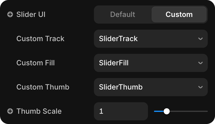
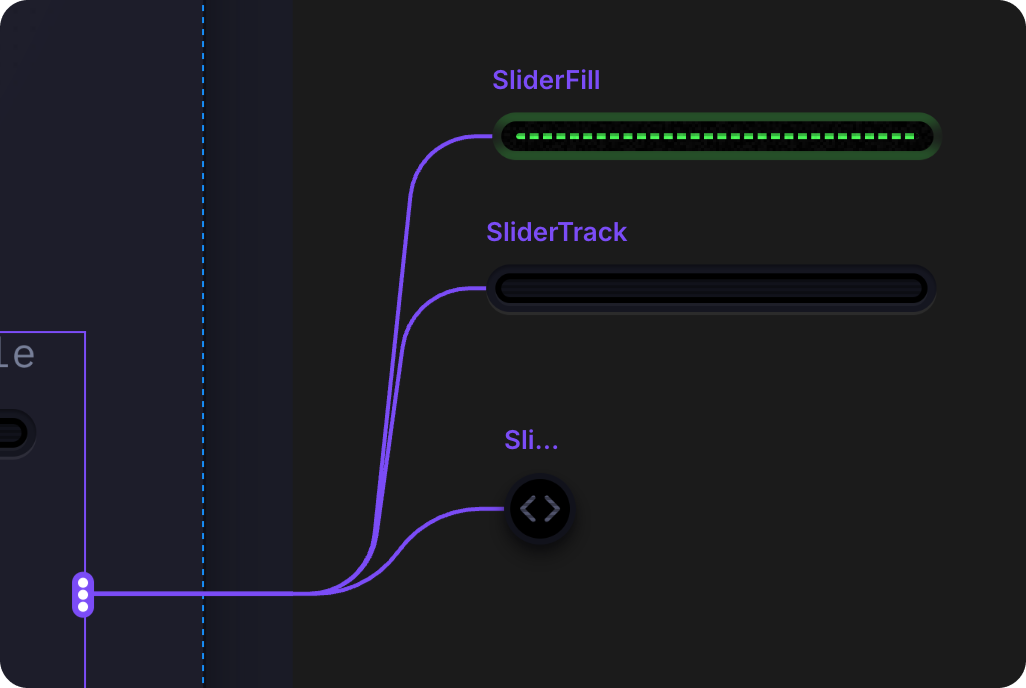
The Track and Fill components are always stretched to 100% width; the Fill is clipped by the current slider percentage.
Gaps
The Gaps property group controls all internal spacing:
| Sub-property | Default | Description |
|---|---|---|
| Gap | 24px | Space between the main sections (inputs block, outputs block, footer) |
| Input Gap | 24px | Space between individual slider rows |
| Result Gap | 16px | Space between individual output items |
| Label ↕ Track | 8px | Gap between the slider label row and the track |
| Label ↕ Value | 4px | Gap between an output label and its result value |