Appearance
ContactForm
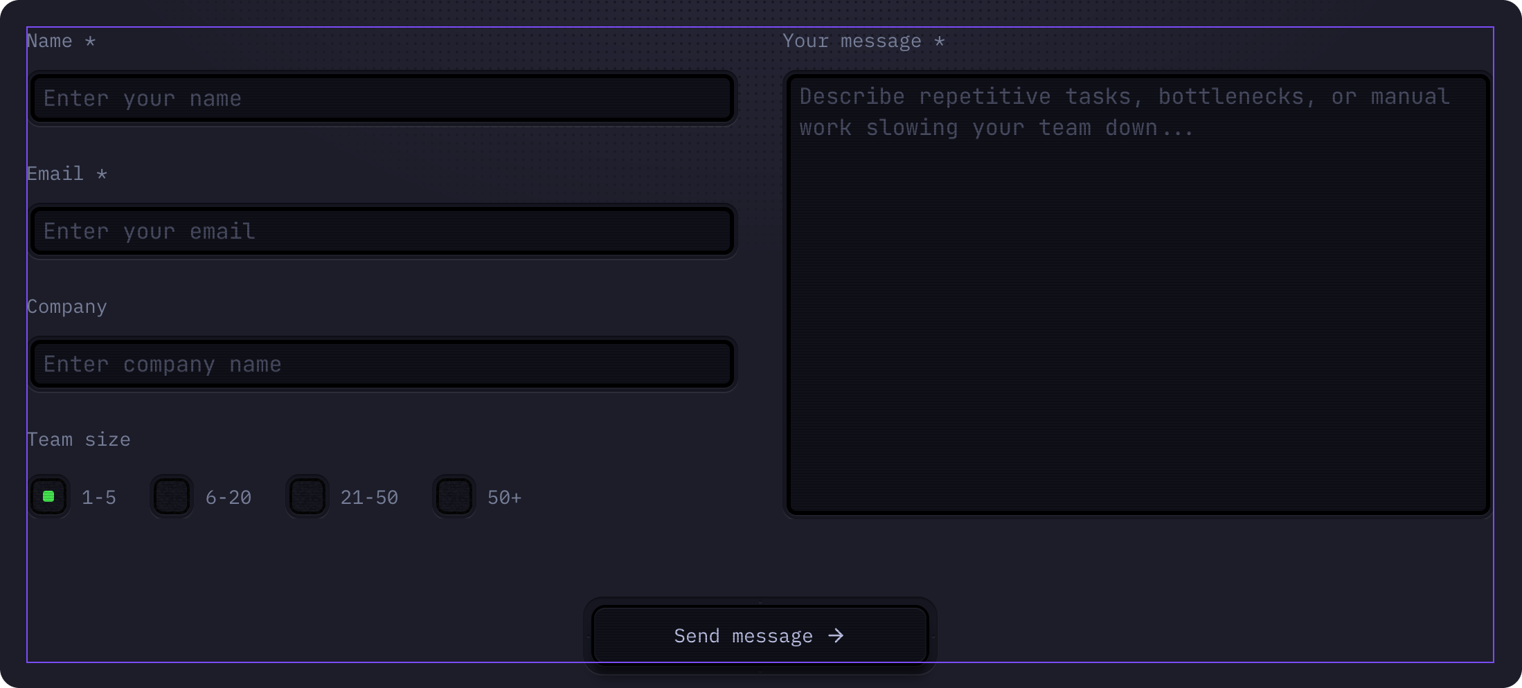
A customizable contact form component that collects user submissions and sends them to your email. Includes fields for name, email, company, team size, and a message textarea.
How to Edit
To customize ContactForm:
- Select the component — Click ContactForm directly on the canvas, OR find it in the Layers panel and click its name
- Open Properties — The Properties panel (right sidebar) displays all editable fields
- Make changes — Edit any property and see changes update in real-time
Setting Up Email Submissions
To receive form submissions in your email:
- Click Edit Component in the Properties panel
- Make sure you're in the Default | Primary variant
- In the Properties panel on the right, find the Form section
- Click Add in the Send To field
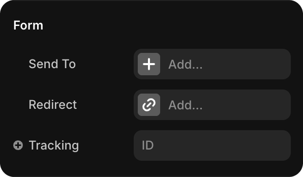
Select Email from the options
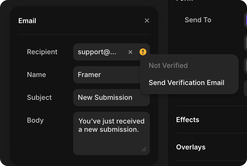
Fill in the email configuration:
- Recipient — Your email address (e.g., "contact@yourcompany.com")
- Name — How the sender appears in the email
- Subject — Email subject line (e.g., "New Contact Form Submission")
- Body — Email message template with form field placeholders
Verify the email address:
- If the email is new, it will show "Not Verified" status
- Click Send Verification Email to verify your address
- Check your email inbox and click the verification link
- Once verified, form submissions will automatically send to your email address
TIP
You must verify the email address before form submissions can be sent. Only verified email addresses can receive form data.
Field Customization
To customize individual form fields (labels, placeholders, required status):
Click Edit Component in the Properties panel
Make sure you're in the Default | Primary variant
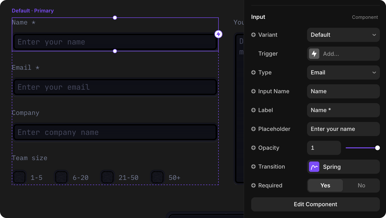
Select the specific Input component you want to modify
In the Properties panel on the right, customize:
- Label — Field label text (e.g., "Name *", "Email *")
- Placeholder — Placeholder text (e.g., "Enter your name")
- Required — Toggle Yes/No to make field required
- Type — Field type (Text, Email, etc.)
Changes to the Primary variant automatically apply to all form instances
Success State
When a user submits the form successfully, the form switches to a Success variant that displays a confirmation message.
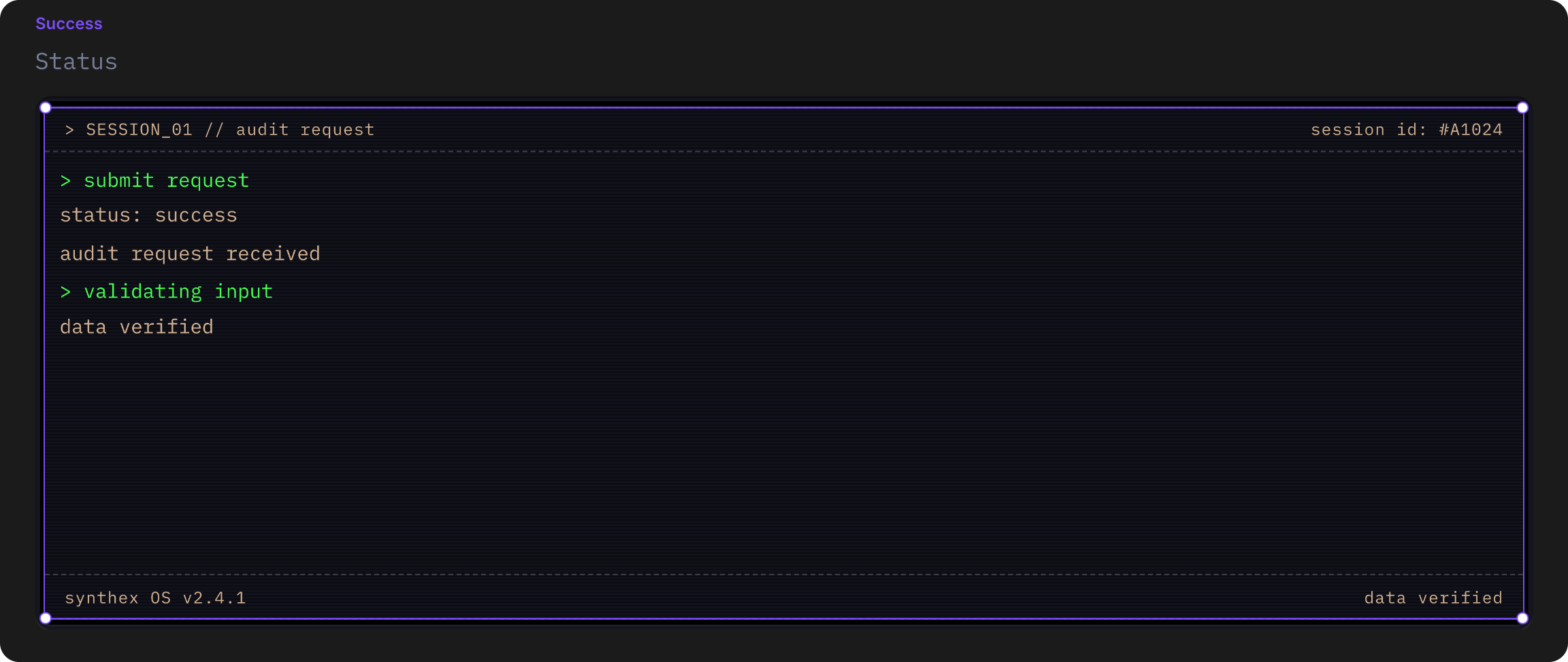
The success message is built using the TerminalDashboard component to show a terminal-style success notification:
- Click Edit Component in the Properties panel
- Switch to the Success variant
- Select the TerminalDashboard component inside the Success variant
- Customize the success message display using TerminalDashboard properties
See the TerminalDashboard documentation for complete customization options.
Mobile Variants
ContactForm includes responsive mobile variants that automatically update with your changes:
| Variant | Use Case |
|---|---|
| DefaultMobile | Mobile version of the form (automatically updates when you edit Default variant) |
| SuccessMobile | Mobile version of the success state (automatically updates when you edit Success variant) |
You don't need to manually edit the mobile variants — they automatically reflect any changes you make to the desktop Default and Success variants. This ensures consistency across all screen sizes.