Appearance
CardPricing & PricingPlans
A comprehensive pricing section component that displays tiered pricing plans with monthly/yearly toggle, customizable features, and responsive variants for desktop and mobile.
Overview
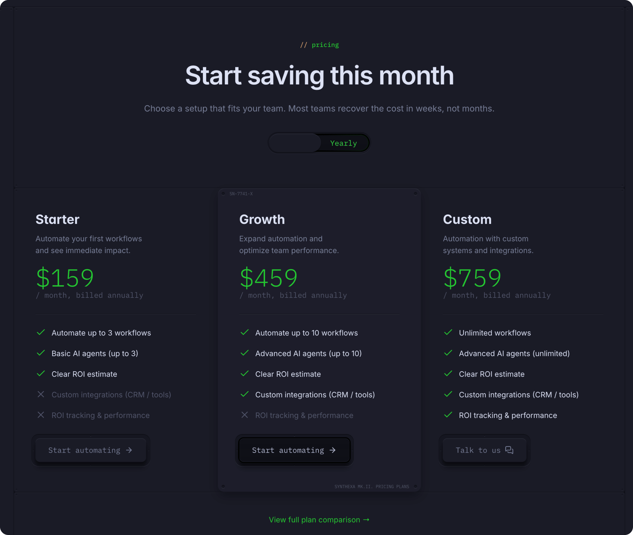
PricingPlans is the main section component that includes:
- Section header with title and description
- Monthly/Yearly toggle switch
- Three pricing plan cards
- Responsive variants for desktop and mobile
CardPricing is an individual pricing plan card with:
- Plan name and description
- Monthly and yearly pricing
- Feature list with inclusion indicators
- CTA button with custom label and icon
How to Edit
Edit Section-Level Properties
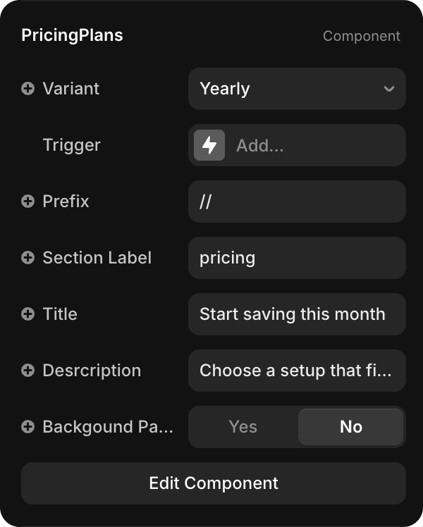
To customize the pricing section header and layout:
Select PricingPlans on the canvas OR in the Layers panel
Open Properties — The Properties panel displays section settings
Edit properties:
- Prefix — Visual prefix (e.g., "//")
- Section Label — Section name (e.g., "pricing")
- Title — Main heading (e.g., "Start saving this month")
- Description — Section subtitle
- Background Pattern — Toggle background pattern visibility
- Variant — Switch between Yearly/Monthly/YearlyMobile/MonthlyMobile
Edit with Edit Component
To access all section variants:
- Click PricingPlans to select it
- Click Edit Component button in Properties
- You'll see 4 variants:
- Yearly (Primary) — Desktop yearly view
- Monthly — Desktop monthly view
- YearlyMobile — Mobile yearly view
- MonthlyMobile — Mobile monthly view
WARNING
Always make pricing changes in the Yearly | Primary variant. Changes automatically apply to all other variants (Monthly, YearlyMobile, MonthlyMobile).
Editing Pricing Cards
Update Plan Information
To edit each plan:
- Important: Always edit in the Yearly | Primary variant first
- Click on the plan card (or select Plan1/Plan2/Plan3 in Layers)
- In Properties, update:
- Title — Plan name
- Description — Plan description
- Monthly Price / Yearly Price — Adjust with slider or type number
- Monthly Text / Yearly Text — Price period text
- Button Label — CTA text
- Link — Button destination
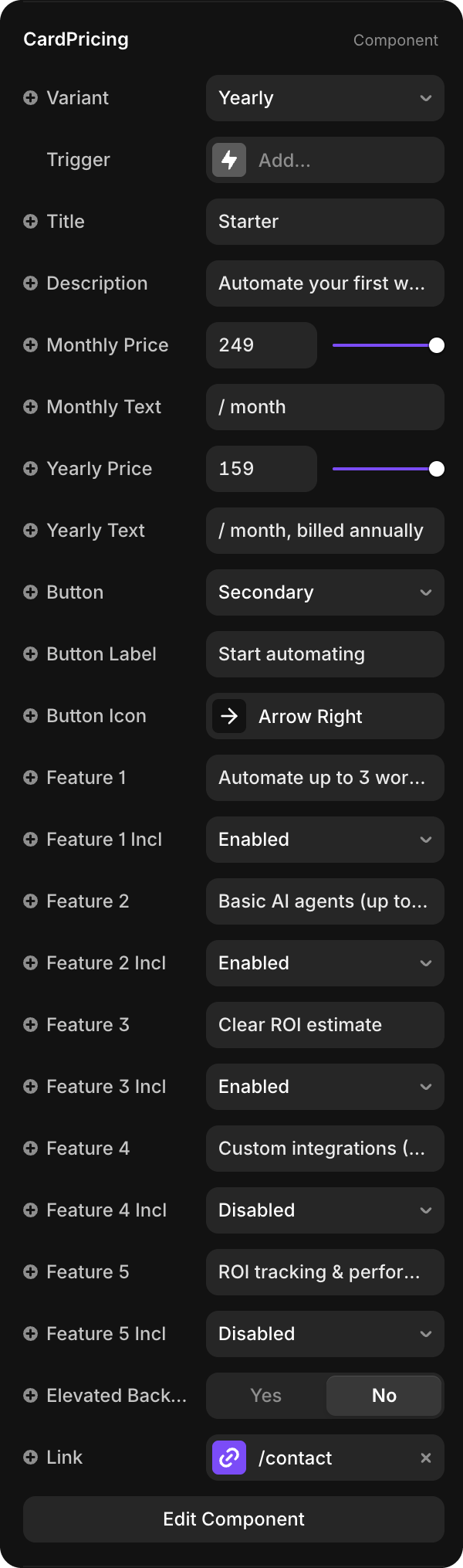
| Property | Type | Description |
|---|---|---|
| Variant | Dropdown | Select Yearly or Monthly pricing display |
| Title | String | Plan name (e.g., "Starter", "Growth", "Custom") |
| Description | String | Brief plan description |
| Monthly Price | Number | Price for monthly billing (slider input) |
| Monthly Text | String | Label below monthly price (e.g., "/ month") |
| Yearly Price | Number | Price for yearly billing (slider input) |
| Yearly Text | String | Label below yearly price (e.g., "/ month, billed annually") |
| Button | Dropdown | Button style (Primary / Secondary) |
| Button Label | String | CTA text (e.g., "Start automating", "Talk to us") |
| Button Icon | Icon | Icon displayed in button (e.g., "Arrow Right") |
| Features 1-5 | String | Feature names (e.g., "Automate up to 3 workflows") |
| Feature 1-5 Included | Dropdown | Enabled / Disabled (show checkmark or X) |
| Elevated Background | Toggle | Add subtle background highlight |
| Link | URL | Button link destination (e.g., "/contact") |
Add or Modify Features
Each plan includes 5 feature slots:
- Click the plan card to select it
- Update Feature 1 through Feature 5 text fields
- Toggle Feature 1-5 Included to show checkmark (Enabled) or X (Disabled)
- Changes appear immediately on both Monthly and Yearly views
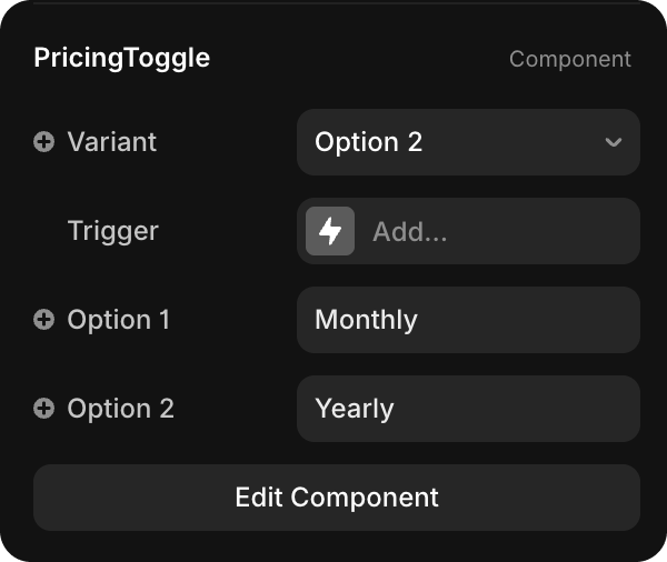
Change the Toggle Labels

To customize "Monthly" / "Yearly" toggle buttons:
- Click Edit Component on PricingPlans
- Make sure you're in Yearly | Primary variant
- Find and select PricingToggle component (in the layers or on canvas)
- In Properties, update the toggle labels
- The toggle width auto-adjusts to fit new text
- Changes apply to all variants automatically
Usage
CardPricing and PricingPlans are used in two locations:
Homepage Pricing Section
The main pricing section with 3 plans, monthly/yearly toggle, and feature highlights.
Pricing Page (/pricing)
Full pricing page that includes:
- PricingPlans section — Same 3 plans with toggle and features
- Detailed Features Table — Complete feature comparison for all plans
- Configured via Pricing CMS Collection
- Shows detailed feature availability per plan
- Includes support tiers, SLA, documentation, and more
CMS Integration
The detailed features table at the bottom of the Pricing page is managed through the Pricing CMS Collection:
- Each feature in the table is a CMS item
- Feature availability (checkmark/X) is controlled per plan
- Support tiers and service level details are configured in CMS
- Changes in CMS automatically update the pricing page table
To add or modify features in the comparison table, edit the Pricing Collection.