Appearance
CardTool
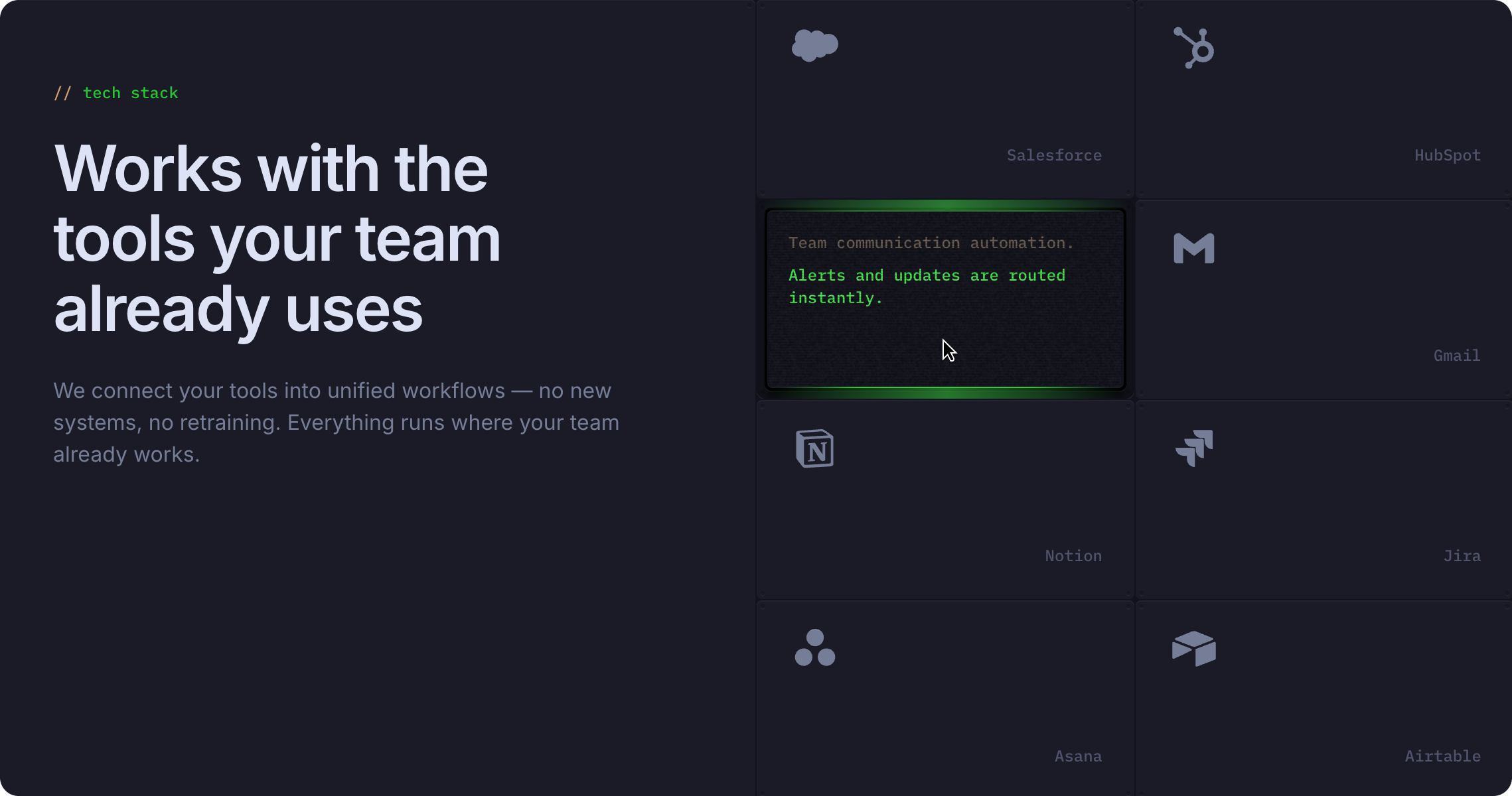
An integration showcase component that displays supported tools and platforms with interactive hover states. Reveals detailed automation descriptions when users hover over tool cards.
Overview
CardTool displays a list of integrated tools and platforms in a grid layout. Each card features the tool icon and name by default, with an interactive hover state that reveals terminal-themed details about what the tool integration does.
Key Features:
- Three interactive variants (DesktopDefault, DesktopTerminalOff, DesktopTerminalOn)
- Tool icon and title display
- Terminal-themed hover descriptions
- Customizable tool names and automation details
- Terminal color theming for consistency
- Grid-friendly layout
How to Edit
To customize CardTool properties:
- Select the component — Click CardTool directly on the canvas, OR find it in the Layers panel and click its name
- Open Properties — The Properties panel (right sidebar) displays all editable fields
- Make changes — Edit any property and see changes update in real-time
Property Controls
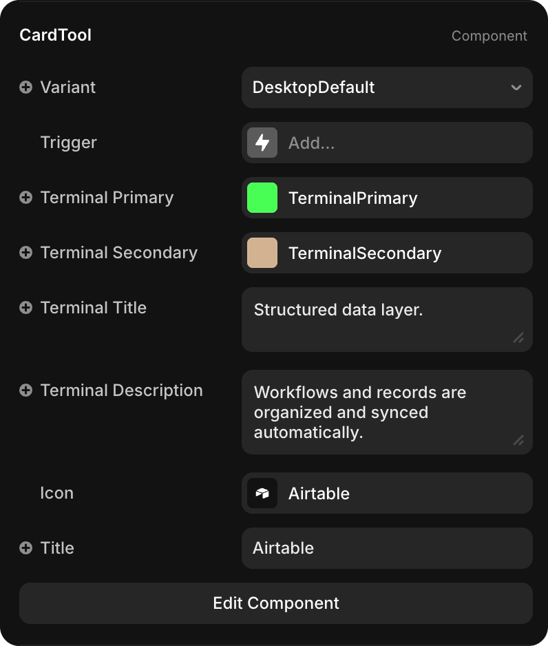
| Property | Type | Description |
|---|---|---|
| Title | String | Tool or platform name (e.g., "Slack", "Salesforce", "Gmail") |
| Icon | Icon Selector | Icon representing the tool (Framer icon or custom component) |
| Terminal Title | String | Brief title of the automation (e.g., "Team communication automation.") |
| Terminal Description | String | Detailed explanation of what the integration does (e.g., "Alerts and updates are routed instantly.") |
| Terminal Primary | Color | Primary color for terminal text and accents (default: TerminalPrimary - bright green) |
| Terminal Secondary | Color | Secondary color for terminal borders and outlines (default: TerminalSecondary - tan/beige) |
Variants Explained
CardTool includes three interactive variants that auto-switch on hover:
| Variant | Behavior | Display |
|---|---|---|
| DesktopDefault | Initial state (default display) | Shows tool icon and title only |
| DesktopTerminalOff | Hover state (transition) | Terminal-style box appears, text in gray |
| DesktopTerminalOn | Hover state (final) | Terminal-style box with TerminalPrimary highlighting on key text |
The hover transition automatically progresses through all three variants: Default → TerminalOff → TerminalOn.